Most Amazon sellers treat Amazon A+ content as a cosmetic upgrade: lovely banners, some icons, and a comparison chart if they feel fancy. Then they wonder why nothing really changes in their numbers.
In reality, Amazon A+ content is one of the few places on your product detail page where you can slow the shopper down in a good way. You can tell a story, answer objections, justify your price, and guide buyers toward the exact variant that’s right for them. Used strategically, it stops being “the pretty part at the bottom of the listing” and becomes a conversion engine that quietly compounds over time.
This playbook walks you through what Amazon A+ content actually does, when it really matters, how to structure it, and the common mistakes that cost sellers money.
Key Takeaways
- Amazon A+ Content is a conversion layer, not a ranking trick. It won’t replace your keyword work, but it makes existing traffic more likely to buy.
- It delivers the best ROI on specific ASINs. High-traffic, low-conversion listings, complex products, premium-priced items, and product families gain the most.
- Structure matters more than decoration. A clear hero, problem–solution narrative, benefits-led features, proof, and comparison are far more powerful than random “nice” modules.
- Most A+ underperforms for simple reasons. Walls of text, generic “premium quality” copy, and inconsistent messaging between bullets and A+ quietly kill trust.
- A+ works best as part of a system. When your ads, main images, bullets, and Amazon A+ content tell one consistent story, you improve conversions, PPC efficiency, and brand perception all at once.
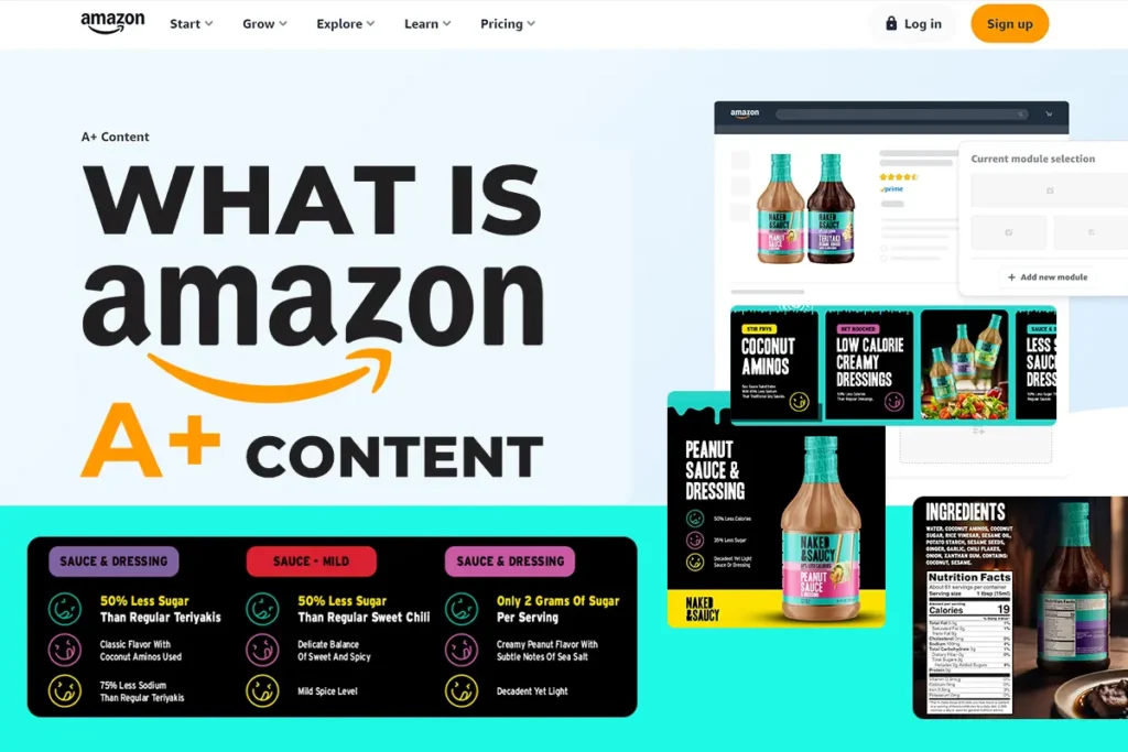
What Is Amazon A+ Content (And What It Isn’t)?
This is the top of a standard Amazon product detail page.
You see the hero image, title, price, reviews, and bullets – but no A+ Content yet.
This is the core listing every seller gets by default. Amazon A+ Content only appears further down the page, inside the Product Description area.
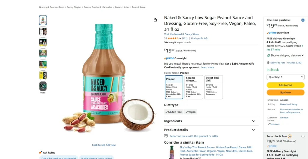
Amazon A+ Content is an enhanced product description format available to brand-registered sellers and vendors. Instead of a single block of plain text, you get a set of flexible modules that combine images, short copy, comparison tables, and brand story elements.
Amazon’s own A+ Content tool describes it as a way for brand owners to showcase products with enhanced images, videos, customized text placements, and shoppable comparison charts on their product detail pages.
Shoppers see Amazon A+ content in the Product Description section of the page. From their perspective, it feels like a mini landing page embedded inside the listing: more visuals, more structure, and more explanation than the standard bullets and gallery can offer.
For a full view of how titles, images, bullets, and content work together on the page, our Amazon listing optimization playbook breaks down the complete structure behind high-performing product detail pages.
To use Amazon A+ content, you typically need a Professional seller account, enrollment in Amazon Brand Registry, and authorization as a Brand Representative.
The official Amazon Brand Registry overview confirms that registered brands gain access to A+ features like enhanced images, product-comparison charts, and richer product descriptions that standard resellers can’t use. In other words, it’s a tool primarily designed for brands that want to build something bigger than a one-off listing.
Functionally, A+ sits in the middle of the shopping journey. The title, price, reviews, and main images get the click and create the first impression.

The bullets answer basic questions. Amazon A+ content then steps in to deepen understanding: it explains how the product works, why it exists, and why this particular version is the right choice.
Just as important as what A+ is, is what it is not. Amazon A+ content is not a primary ranking factor. The text inside A+ is not treated the same as your title, bullets, or search backend keywords. It’s not a rescue tool for products with bad quality, poor reviews, or no clear market fit. And it’s not a place for shortcuts—Amazon prohibits pricing language, discount messaging, external URLs, and competitor call-outs.
On Amazon, an average of 83% of buyers buy solely based on images, so that’s where most of your resources should go.
Think of A+ as a conversion tool inside a larger system. If your product, keywords, reviews, and images are already doing their job, A+ can amplify the result. If those fundamentals are broken, no amount of premium layouts will fix them.
When Does Amazon A+ Content Actually Matter for Sellers?
Not every listing deserves the same level of investment. You’ll get more from Amazon A+ content if you’re deliberate about where you deploy it.
If you’d rather have specialists prioritize and rebuild those pages for you, our Amazon listing optimization service focuses on high-impact ASINs first and aligns copy, images, and A+ content into a cohesive system.
High-Traffic, Low-Conversion Listings
The first place to look is any ASIN with strong traffic but a disappointing unit session percentage. In these situations, you don’t have a visibility problem; you have a persuasion problem.
Shoppers are already finding the listing. Something on the page is making them hesitate.
Amazon A+ content gives you space to answer the “but…” that lives in their head:
- But is this really the right size?
- But what’s actually included in the box?
- But what makes this worth more than the cheaper option?
Even a modest lift in conversion on a high-volume product can translate into a meaningful revenue increase without touching your ad budget. That’s where a good A+ tends to pay for itself fastest.
Complex Products That Need Visual Explanation
Some categories simply can’t be explained in five bullets. Electronics with multiple ports and modes, tools and equipment that require assembly, multi-piece kits, or anything where sizing and compatibility are critical all fall into this group.For these listings, Amazon A+ content becomes a visual manual fused with a sales page. You can break down how the product works, piece by piece. You can show diagrams, step-by-step usage, and “before/after” scenarios that make abstract claims concrete.
People don’t just buy products that look cool and colorful—they want to see how that product will actually improve their life. That’s why having a budget for professional photography is key to success.
The more clearly buyers understand what they’re getting and how to use it, the less likely they are to return the product or leave a frustrated review. That alone can improve long-term performance across the entire category.
Premium-Priced or Brand-First Products
If you’re priced significantly above generic competitors, you can assume one thing: buyers are quietly asking, “Why should I pay more?”
Amazon A+ content is your best place to answer that question without sounding defensive or salesy. Here, you can show:
- The materials and components you use and why they matter
- The manufacturing, testing, or quality control behind the product
- The design decisions that make it last longer or perform better
- The mission or values that differentiate your brand
Instead of vague claims about “premium quality,” you can demonstrate what “premium” actually looks and feels like in your category. Suppose you’re rethinking how your entire catalog appears on Amazon. In that case, this kind of storytelling should fit into a broader Amazon brand strategy framework that aligns content, pricing, and brand protection across every touchpoint. For newer brands, this also helps overcome the “is this legit?” moment that often blocks first-time purchases.
Product Families and Line Extensions
If you sell multiple related products, product families, or line extensions, A+ comparison charts are compelling. They let shoppers see all their options on a single screen, instead of bouncing between tabs and losing context.
With Amazon A+ content, you can lay out different sizes, colors, capacities, bundles, or good–better–best tiers in a single visual table. A buyer who came in for a basic version might realize a slightly more expensive variant is a better fit. Someone who didn’t know a complementary product existed might add both to their cart.
At that point, A+ stops being just “content” and starts acting like light merchandising and product navigation.
The Anatomy of High-Converting Amazon A+ Content
High-performing A+ doesn’t happen by accident. It follows a structure designed around how people actually make decisions.
Start with Messaging, Not Modules
Many brands approach Amazon A+ content backwards. They open the A+ builder, choose attractive modules, and then try to cram copy into the empty fields.
A better approach is to define the message first:
- What is the core promise of this product?
- What top benefits matter most to the target buyer?
- What objections and fears consistently block the sale?
- What proof do you have to support your claims?
Once you have those answers, you can decide which modules you genuinely need and where each idea should sit. Design then becomes a way to support the messaging—not a distraction from it.
Your A+ should echo and extend what you’ve already promised in the title and bullets, not introduce a new angle out of nowhere.
A Simple Block Framework You Can Reuse
A reliable framework for Amazon A+ content might look like this:
- Hero block. A clean banner with the product, one strong headline, and a brief line that captures the primary outcome. This is your “why this product” moment in one glance.
- Problem–solution block. A short section that calls out the real-world problems your buyer faces and shows how the product solves them. This connects emotionally and practically.
- Features-into-benefits block. Instead of listing specs in isolation, you pair features with what they enable: quieter nights, faster setup, less mess, better comfort.
- Use-case or lifestyle block. Visuals that show the product in context: in the home, on the go, at work, in the gym. You help the shopper see themselves using it.
- Comparison block. A chart that lays out related ASINs and clarifies who each one is best for. This reduces paralysis for buyers who are overwhelmed by choice.
- Proof and trust block. Certifications, test results, safety standards, or guarantees presented clearly and honestly. This reassures more cautious buyers.
- FAQ block. A small set of questions and answers tackling the last remaining doubts: sizing, compatibility, use, maintenance, or what’s included.
You won’t always use every block, and the order can shift slightly by category. But the principle is the same: you lead the buyer from “What is this?” to “Is this right for me?” to “Yes, I’m ready.”
Amazon A+ Content Best Practices for Sellers
Even with the right structure, details matter. The way you write and design can easily make or break performance.
Write Copy That’s Short, Specific, and Benefit-First
Compelling Amazon A+ content copy is surprisingly lean. Shoppers are scanning, not studying.
That means:
- Short paragraphs with a single clear idea
- Concrete details instead of vague adjectives
- Benefits that translate features into real-life outcomes
“Durable fabric” becomes “rip-resistant fabric that survives daily school runs.”
“Ergonomic design” becomes “curved handle that reduces hand strain during long shifts.”
Each line earns its place by helping the buyer imagine a better, easier, or safer experience.
Design for Shoppers, Not for Awards
Good visuals serve the shopper. They don’t just look nice; they reduce effort.
In practice, that means:
- Showing the product clearly from useful angles
- Using callouts and arrows to explain less obvious features
- Maintaining enough white space so the eye can rest
- Aligning fonts, colors, and tone with the rest of your brand presence
Overly complex compositions, huge text layered over busy backgrounds, or heavy reliance on unrelated stock imagery all work against you. If someone has to squint or zoom in to understand what’s going on, the design is doing too much.
Build for Mobile First
A large share of Amazon traffic is mobile. That has major implications for Amazon A+ content.
On a phone, everything stacks into one column. Long tables become tall. Dense paragraphs become overwhelming. Tiny text becomes unreadable.
To keep the experience smooth:
- Assume a single-column, vertical scroll; design accordingly
- Keep tables and comparison charts simple and focused on the essentials
- Use font sizes that remain legible when scaled down
- Put your strongest, clearest blocks higher in the A+, not buried at the bottom
Always preview the final layout on both desktop and mobile before submitting.
Respect Amazon’s Content Rules
Amazon is strict about what can appear inside Amazon A+ content. Ignoring the rules risks rejection or removal.
Common pitfalls include:
- Mentioning prices, discounts, or promotions
- Using time-sensitive phrases like “new,” “latest,” or “this year’s”
- Comparing directly to competitors by name
- Making unsubstantiated claims such as “#1” or “best in the market”
- Adding external links, email addresses, or QR codes
Staying within the guidelines doesn’t make your content weaker. It forces you to focus on the product experience instead of shortcuts.
Common Amazon A+ Content Mistakes (and How to Fix Them)
Even experienced brands fall into predictable traps with their A+.
Walls of Text and No Visual Hierarchy
One of the fastest ways to lose a shopper is to stack long paragraphs in small fonts with no clear visual structure. It feels like work to read, so people don’t.
The fix is simple but powerful: break information into smaller, scannable chunks. Use headlines that communicate actual benefits, not just labels. Support each piece of text with a visual that carries part of the message.
Your goal is for a shopper to get the gist of the entire Amazon A+ content section in a quick skim, then pause and read deeper where they personally care.
Generic Messaging That Could Fit Any Product
If your copy could be pasted onto ten other listings in your category with almost no changes, you’re blending in.
“Premium,” “high quality,” and “best in class” don’t mean anything by themselves. The shopper has seen those words too many times.
Instead, ask: What is uniquely true about this product and this brand? Then write that. Mention the exact material grade, the specific test standard, the type of user it was built for, or the results someone can reasonably expect.
Disconnected Story Between Listing Elements
Some A+ sections look like they belong to a different product than the title and bullets. The promise at the top of the page is one thing, but the story in the A+ is something else entirely.
This erodes trust.
To fix it, align your assets. The main promise in your title should reappear, expanded, inside Amazon A+ content. The top three bullet benefits should be visible again in visuals, callouts, and short explanations. The look and feel should match what buyers see in your gallery and Brand Store.
When every part of the listing points in the same direction, buyers feel more confident.
“Set It and Forget It” Thinking
Amazon A+ content is not something you publish once and never revisit. Your audience evolves, competitors shift tactics, and your reviews surface new objections you hadn’t thought of.
Make it a habit to:
- Review performance on A+ vs non-A+ listings
- Read reviews and customer questions for patterns you can address in the FAQ or visuals
- Refresh hero messaging if your positioning changes
- Adjust comparison charts as your catalog grows
A few thoughtful updates a couple of times a year can keep your A+ aligned with current reality and protect conversion rates.
How Amazon A+ Content Impacts Performance
All this effort around Amazon A+ content yields three primary outcomes: better conversions, more efficient PPC, and stronger brand presence.
Conversion and Return Behavior
When shoppers understand what they are buying, they are more likely to complete the purchase and less likely to return it. Clear visuals, honest expectations, and specific benefits make the decision feel safe.
On high-traffic ASINs, even a small uplift in unit session percentage from a strong A+ can translate into substantial incremental revenue over a year.
PPC Efficiency
PPC sends visitors to the listing. A+ helps decide whether that click turns into an order.
When Sponsored Products and Sponsored Brands send traffic to pages with aligned titles, strong gallery images, focused bullets, and compelling Amazon A+ content, the odds of conversion go up. That can improve ACOS, strengthen ROAS, and give you more room to scale campaigns without burning margin.
Brand Perception on Amazon
Finally, there’s the brand effect. If your catalog shares a consistent A+ style—similar layouts, tone, and visual language—shoppers start to recognize you. They don’t just remember the product; they remember the brand.
That recognition shows up in branded searches, repeat purchases, and better performance when you send external traffic from social, email, or search engines to your Amazon listings.
Conclusion: Turning A+ Into a System, Not a Decoration
Amazon A+ content is easy to underestimate. It lives below the fold, it takes time to design, and it doesn’t feel as urgent as keywords or bids. But for serious brands, it becomes one of the quiet levers that separates “just another listing” from a well-oiled sales asset.
If you treat A+ as decoration, that’s all you’ll get: something that looks nice but doesn’t move numbers. If you treat it as a structured conversion layer—aligned with your positioning, your creative, and your ad strategy—it becomes an engine for higher conversions, stronger brand trust, and better long-term performance.
Start with your highest-impact ASINs. Define the message before the modules. Use a clear block framework. Fix the common mistakes. Then keep iterating based on real behavior.
That’s how Amazon A+ content stops being an afterthought and starts doing the quiet, consistent work of turning browsers into buyers.
FAQ
Not directly. It’s a conversion tool, not a primary ranking factor—its job is to turn existing traffic into buyers.
Start with high-traffic, low-conversion ASINs, complex products, premium-priced items, and product families that benefit from comparison charts.
Use a simple flow: hero block → problem–solution → features-into-benefits → lifestyle/use-cases → comparison + proof/FAQ.
Keep it short and benefit-first. One idea per short paragraph, concrete details, and let visuals carry half the message.
Yes. In most cases, you need a Professional account plus Brand Registry approval to unlock A+ modules for your ASINs.